Color can help you look younger, better rested, more powerful, and overall more attractive? The trick is identifying the unique colors in your complexion and wearing colors that mirror (ie wearing a top in the same coral tone as your cheeks) or contrast (ie wearing red lipstick to bring out the green in your eyes) them.
If you’re new to the color scene, here is an easy place to start. Ask yourself, do I prefer to wear navy and grey or brown and khaki. We usually gravitate to hues that are cohesive with our overall coloring, even if we don’t feel completely confident in every color selection. This initial color choice identifies whether you prefer warm or cool hues (see more details below), then depending on the depth or value of your complexion, you can start looking at possible color categories.
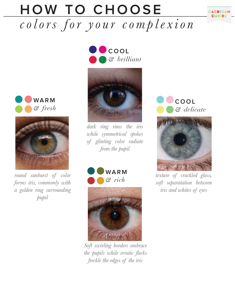
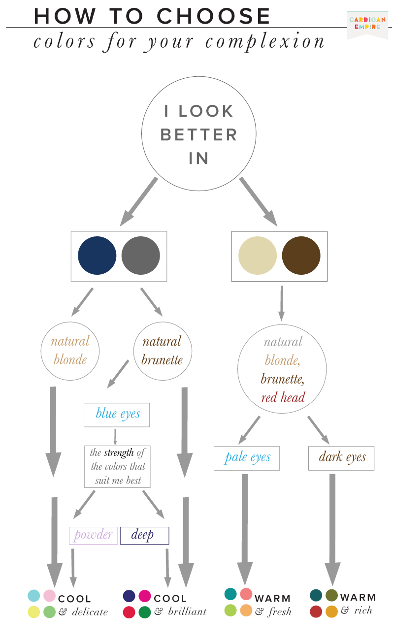 I’ve also found the pattern in your eyes to be a helpful clue in uncovering your best and worst colors. Cool & Brilliant, Winter eyes tends to have symmetrical patterns with spokes radiating from the pupil, the iris is then ringed with a strong border, clearly separating the whites of the eye. The division between iris and white in a Cool & Delicate, Summer eye is much more subtle. Their pattern is commonly like crackled glass. Warm & Rich, Autumn eyes have an irregular pattern with swirls embracing the pupil and freckles spotting the iris. Finally, Warm & Fresh, Spring eyes show a sunburst of color, commonly with a golden ring surrounding the pupil.
 In the beginning, color analysis only offered four color categories, obviously insufficient for the diversity in the general population. Over time, the system added neutral blended seasons for a total of twelve options: Deep Winter / Cool Winter / Cool Summer / Light Summer / Soft Summer / Soft Autumn / Deep Autumn / Warm Autumn / Warm Spring / Light Spring / Clear Spring.
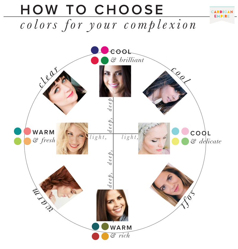
Here are a few examples of social influencers and there color categories.
Deep Winter: Rachel Parcell, Pink Peonies
Cool Winter/Summer: Marianne Verilli, The M.A. Times
Light Summer: Becki Crosby, Whippy Cake
Soft Summer/Autumn: Julia Hengel, Gal Meets Glam
Deep Autumn: Cori Robinson, DressCorilynn
Warm Autumn/Spring: Emily Meyers, The Freckled Fox
Light Spring: Brooke White, The Girls with Glasses
Clear Winter/Spring: Hilary Rushford, Dean Street Society
Each complexion is still unique but the categories offer a starting point so you don’t have to uncover every color from scratch. In the end you should know your color components (Hue, Value, and Chroma) whether you should opt for warm or cool, Clear or Soft, and Deep or Light.
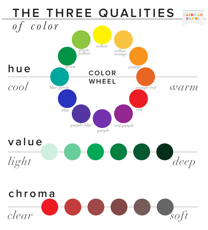
Hue refers to the name of the color family (red, orange, yellow, green, blue, purple, violet). Red, orange, and yellow and their combinations on the left of the color wheel are warm. On the right of the color wheel are the cool hues: blue, green, and violet.
Value refers to the relative degree of lightness or darkness/deepness of a hue. White is positioned at the top of the value scale (high value), gray in the middle (mid-value), and black at the bottom (low value).
Chroma refers to the purity of a color. The purest chromas are the primary colors: red, yellow and blue. Soft chromas are diluted by the presence of another color. Weak or soft chromas appear muted and dull. Pure chromas appear vivid and intense.
What do you think your color category is? Tell me in the comments below.
TRY
Warm & Rich (aka Autumn)
Cool & Brilliant (aka Winter)
Warm & Fresh (aka Spring)
Cool & Delicate (aka Summer)
Still want some help identifying your best and worst colors, purchase a virtual color consultation below: