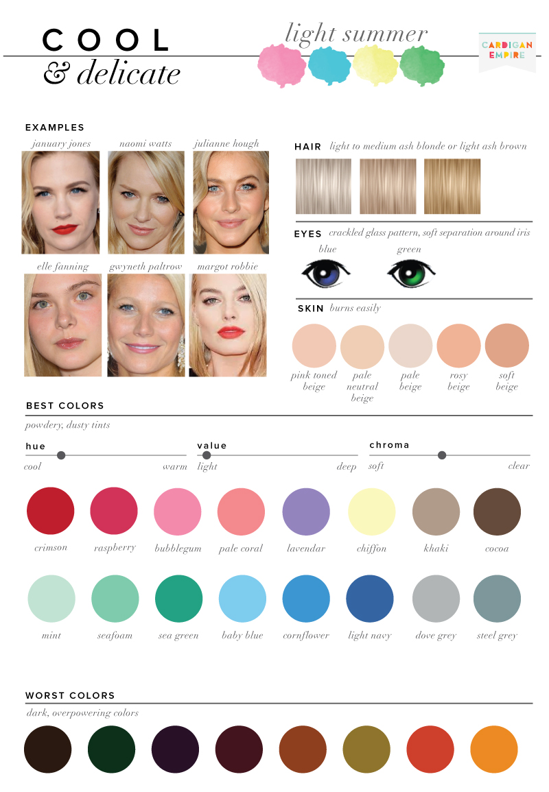
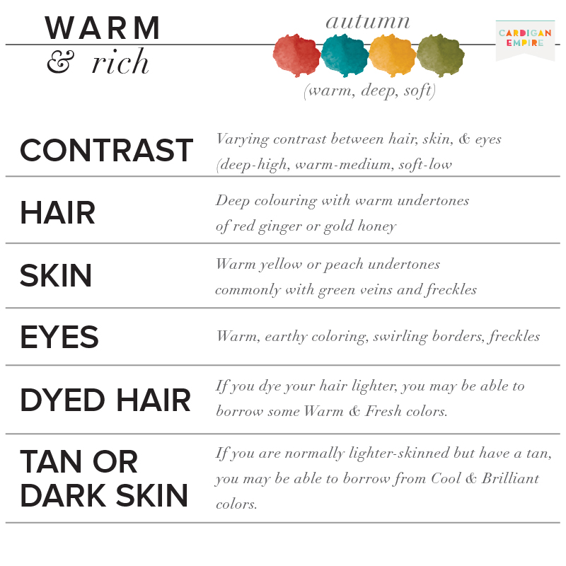
Light Summers have an ethereal quality to their complexions. They are very low in contrast and can wear pale colors that wash out others.
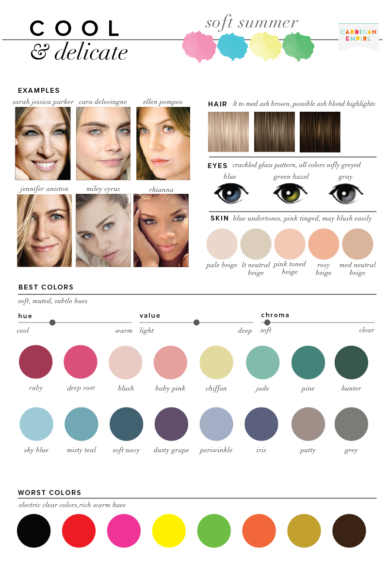
Soft Summer is the warmest of the Summer seasons, it is bordering the Autumn category and has a neutral quality rather than purely cool.
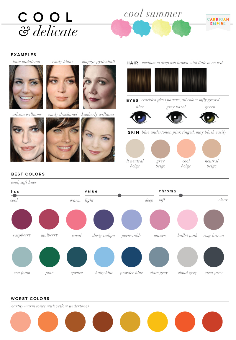
Cool Summer has more contrast than other versions of Summer, it is flowing into the Winter category and includes shades (colors mixed with black).
——————————————-
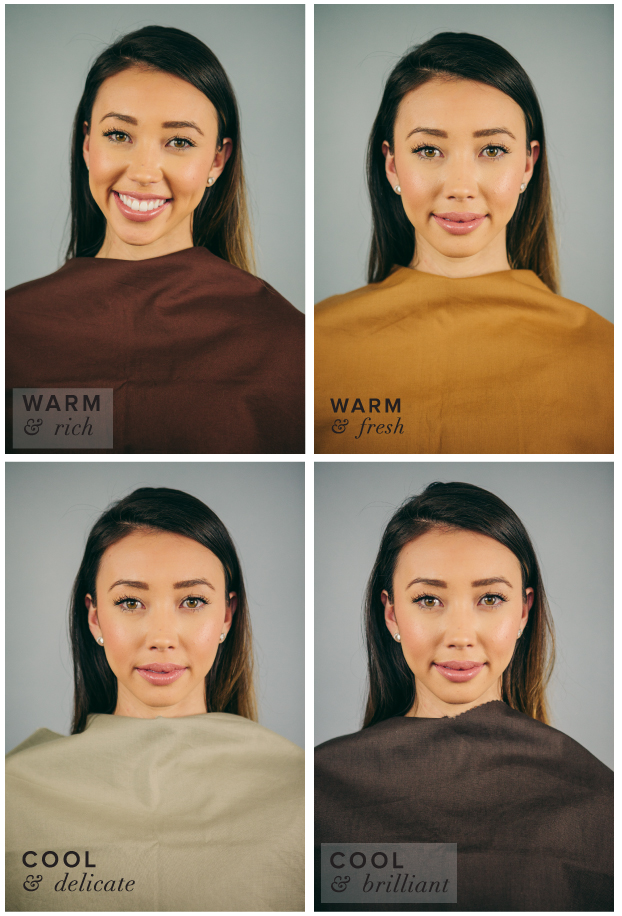
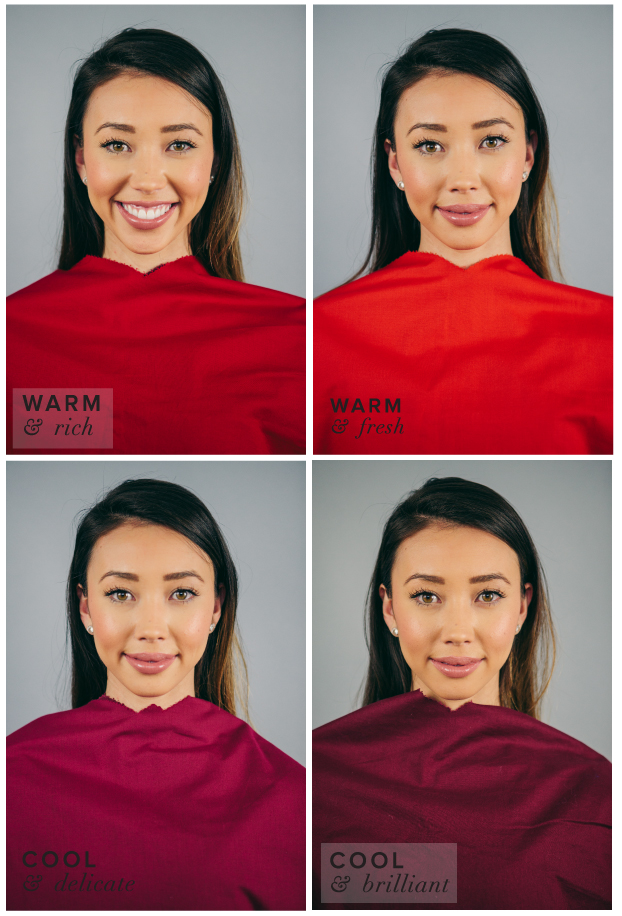
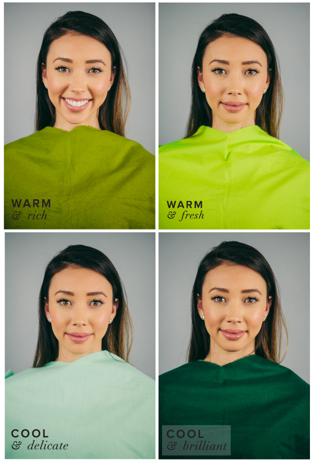
Meet Breann Bowman of Things We Fancy, also a Cool & Delicate, Light Summer. Her profile page states that she never wears color, but maybe these candy colored options can give her some inspiration. Follow along through the color draping to uncover your own coloring. Each drape represents a season: Warm & Rich – Autumn, Warm & Fresh – Spring, Cool & Delicate – Summer, Cool & Brilliant – Winter.
click to watch, or follow along with the photographs.

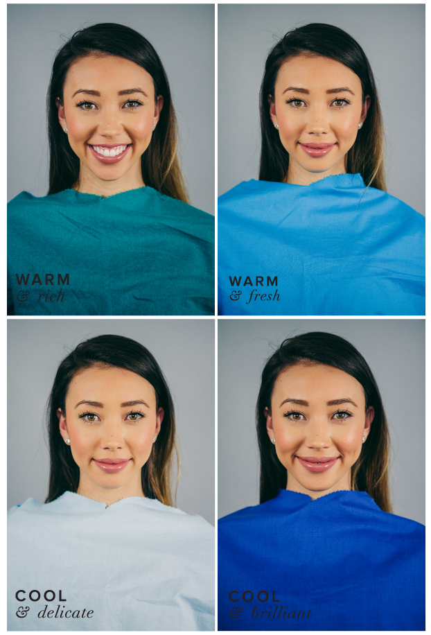
I absolutely adore Breann in Silver, it shows off the beautiful rosy tones in her skin and makes her blue-green eyes pop.

It’s easy for a light summer to get overwhelmed by color. With the Mint, we see her first, not the color.
 Her best blue, Powder Blue, really shows off her flawless skin.
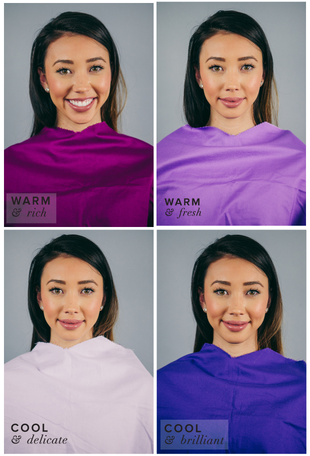
 So many other complexions are drained by pastels, but the subtle contrast between Breann’s eyes, hair, and lips means she shines in pastels like Lavender.
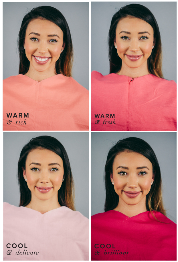
 Breann’s cheeks and lips are enviable, and I love how the Powder Pink picks up that healthy glow. I also love the coral on her. It’s not uncommon to be able to borrow a color or two from a similar season, in this case Light Spring, which shares a similar saturation.
 Breann really shines in Cranberry, unlike the Burgundy which has too much black and leaves her looking pale, and the Flame and Brick which are too warm, the Cranberry contrasts the green in her eyes and brings out the pink in her cheeks. It’s one of my favorite colors on her and according to David Zyla in Color Your Style, this would be her Romantic Color..
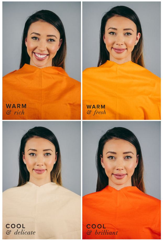
 Orange may not be the new black for Breann, but peach is definitely the least offensive of the group. It matches up with the subtle contrast in her complexion.
 Typically warm colors like yellow can have cool interpretations, by subtracting some of the red, it leans away from gold toward Lemon and Chiffon.
Photos by Red Poppy Photo, Breanne Johnson
——————————————-
Not Cool & Delicate (aka Summer)
TRY
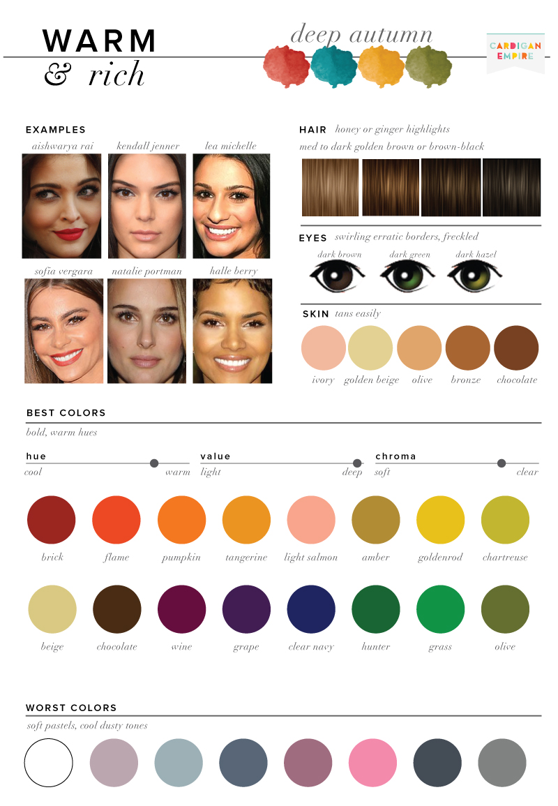
Warm & Rich (aka Autumn)
Cool & Brilliant (aka Winter)
Warm & Fresh (aka Spring)
How to Pick your Best and Worst Colors (Get Started)
Want a professional opinion? Purchase your own color consultation below.:

 Notice how the Olive Green brings out the green in her hazel eyes.