Traveling from Tacoma, Mrs. Kirsten allowed me the pleasure of styling her with some of the summer 2011 edition trends.


 |
| (Blazing Blouse, Climate Control Cardi, J Brand Love Story Petite) After season, season, season of skinny silhouettes dominating runways, the 70’s inspired wide leg and flare has made its triumphal return. Prolific in denim, it also flatters in twill and summer friendly linen. But while the leg line universally flatters straight and curved, tall and short, select your rise carefully. While a high retro rise might look lovely on a linear, the uninterrupted contrast between a lower figure’s narrow waist and voluptuous bottom could create an unfair comparison. |

Summer Trend 2: Green
  |
| (Phoenix Rising Top, Shape Suggestion Skirt) Apple, aquamarine, blue-green, fir, grass, jade, kelly, lime, moss, olive, peacock, sage, sea, viridian, willow, whether you favor its association with ecofriendly habits, capitalistic currency, or its calming consequences, green is summer 2011’s chroma of choice. Warm skin tones with yellow undertones may favor moss, Warm and Fresh could opt for apple. Cool and Brilliant complexions may choose to compliment with blue-tinged emeralds or spruces while Cool and Delicates experiment with paler shades of mint. |
Summer Trend 3: Pattern Play
 |
|
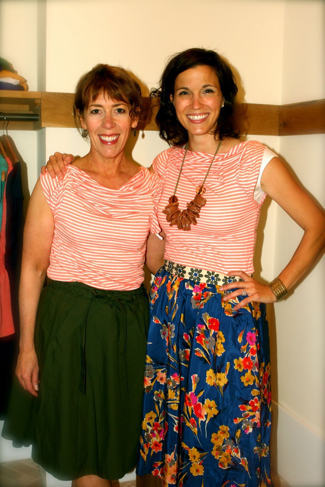
(Kirsten: Pleated Yoke Tee, Plait & Pleat Skirt; Reachel: Pleated Yoke Tee, Goldfield Skirt)
Mix a bold extroverted print (such as a floral) with a soft spoken, shy print (like a small polka dot, stripe, or even a texture like lace). This strategy keeps prints from bickering and competing with each other for leadership. Next make sure the pieces of clothing share a color story. They can either include marks of the same hue or they can descend from the same color family. |

Summer Trend 4: Colorblocking
 |
| (Winner’s Circle Tee, Climate Control Cardi, Plait & Pleat Skirt) If you’re not into mixing patterns or prints, one can utilize color blocking into their summer wardrobe. Color blocking is great for someone who is not as bold or daring when it comes to mixing prints, so instead they can mix color. The trick is to pair the colors in a fashion in which they complement each other. For example, you could do a hibiscus red blouse paired with a brownish maroon skirt. The skirt off plays as a neutral. Make sure the colors are either grouped next to each other on the color wheel or you can go opposite, like a navy blue pencil skirt with a lovely satin one-sleeve tangerine tone blouse. Make sure you know what fits you properly and what colors complement your skintone. |
Summer Trend 5: Espadrilles
To finish any of these looks off? A espadrille wedge. Whether you select a leg lengthening neutral or a saturated statement, these will keep the look fresh and playful.
Thanks to my super stylist interns

MacKenzi for assisting in styling Kirsten

And Martha for helping me research our Summer 2011 trends.

And Martha for helping me research our Summer 2011 trends.
Feed me fashionably fresh
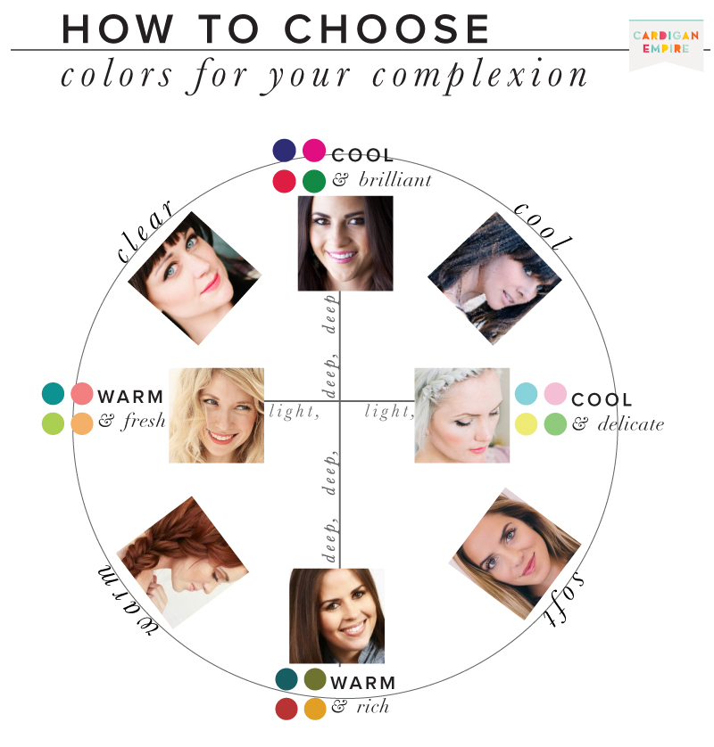
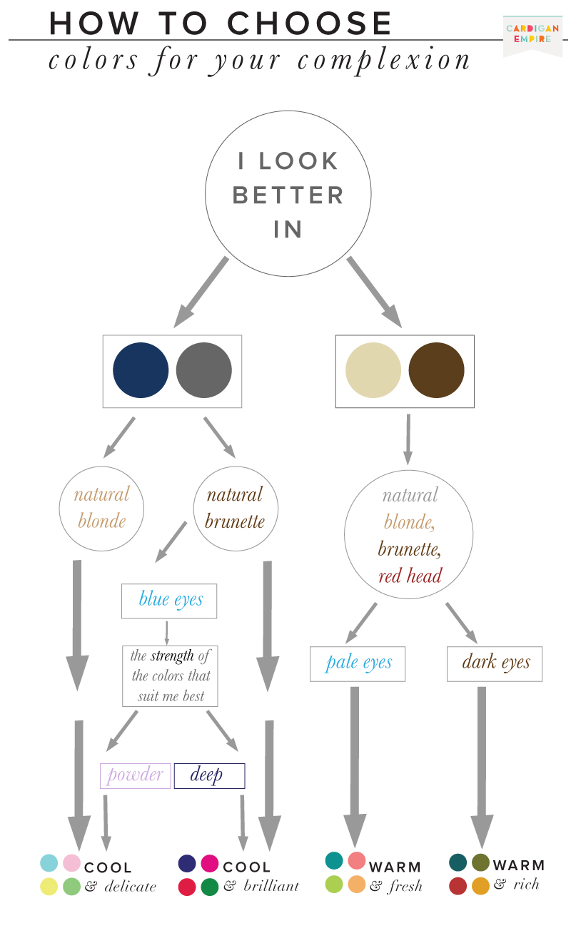 I’ve also found the pattern in your eyes to be a helpful clue in uncovering your best and worst colors. Cool & Brilliant, Winter eyes tends to have symmetrical patterns with spokes radiating from the pupil, the iris is then ringed with a strong border, clearly separating the whites of the eye. The division between iris and white in a Cool & Delicate, Summer eye is much more subtle. Their pattern is commonly like crackled glass. Warm & Rich, Autumn eyes have an irregular pattern with swirls embracing the pupil and freckles spotting the iris. Finally, Warm & Fresh, Spring eyes show a sunburst of color, commonly with a golden ring surrounding the pupil.
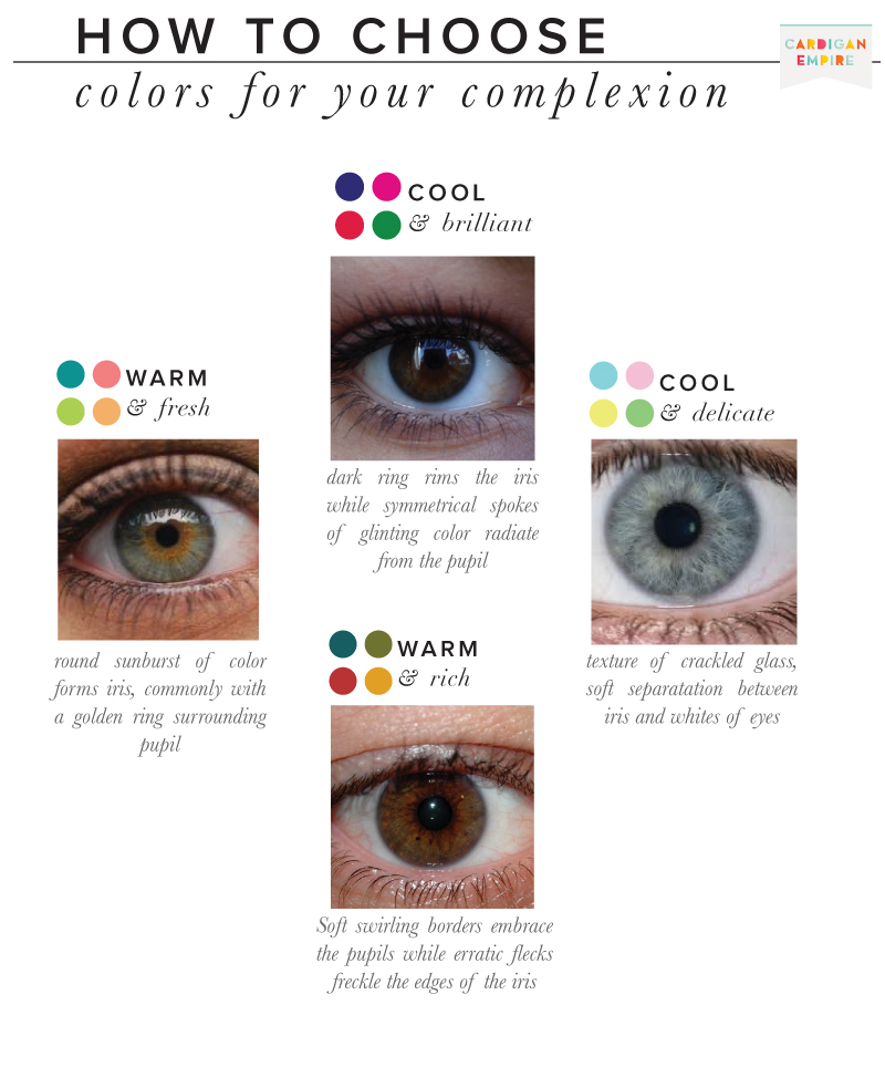 In the beginning, color analysis only offered four color categories, obviously insufficient for the diversity in the general population. Over time, the system added neutral blended seasons for a total of twelve options: Deep Winter / Cool Winter / Cool Summer / Light Summer / Soft Summer / Soft Autumn / Deep Autumn / Warm Autumn / Warm Spring / Light Spring / Clear Spring.