Cardigan Empire

Salt Lake City Fashion Stylist

  • ABOUT
    • Credentials
    • Press
    • Testimonials
  • SERVICES
    • Color Analysis
    • Fashion Lookbook
    • Local Services
    • Closet Cleaning
  • FIT GUIDES
    • Top Jeans
    • Modest Shorts
    • Leggings Comparison
    • Find Perfectly Fitting Clothes
    • Best Swimsuits for Your Bottom
    • Best Swimsuits for your Belly
    • Best Swimsuit for Your Bust

How to Dress for a Family Photo: Pattern Play


Happy Thanksgiving Fashion Pilgrims!
Florence Welch & The Machine
 Creative playfulness, unexpected essentia, the province of patterns.  If you choose to advance your family portraits Austin into the realm of pattern, choose supporting ornamentations.  Select simple patterns like small florals, pinstripes, and polka-dots.  You and your dear ones are the photographic Prima Donnas so don’t surrender the spotlight to a bright ikat. 
Also consider the placement of patterns.  One pattern is all one family member should likely sustain.    If possible, refuse your patterns immediate contact. Solids provide critical white space for your family assembly.  
Keeping all your patterns in the same color family can add further sophistication. The more colors, patterns, and people you introduce, the greater chance for ocular disjoint.
Speaking of adding more members to the photograph, more people should directly translate into more motif caution. Whereas a spattering of stripes and florals will not overwhelm a family of four, it could enact a pictorial cataclysm in a family of fifty.   
Patterns can practice spotlight thievery, just when your rosy cheeks are ready to shine, Auntie Clementine’s fluorescent brocade bares its brilliance stealing the shutter’s concentration. Squelch the focus filching by opting for unassuming solids. Solids are natural supporting actors, allowing visages to take the lead.
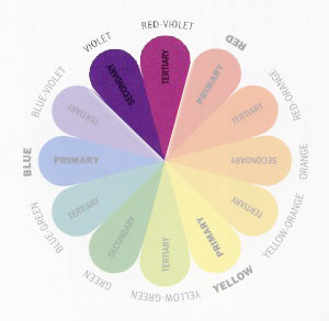
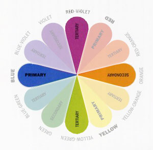
For large or extended family portraits,  a similar range of solid colors makes it easy to identify confederate members in your extended family portrait. Clothing doesn’t need to match exactly, but it should blend.   Individual garments ought to share similarities in hue (pigment), value (light/dark), and/or chroma (purity). A palette of ocean blues (similar hue), bold primary colors (similar value), or ashy pastels (similar purity) would place each family member on equal color footing.  However, if you place cousin Sally in scarlet and niece Brenda in beige, there will be talk of favoritism. Sally will bloom and Brenda will recede into an angst filled background.
The final step arrives tomorrow, to your color theory and pattern play, add props.
And if you haven’t yet entered this week’s giveaway…
Allow Cardigan Empire to style your kin for their next Family Photo. Click here to book a family-sized virtual shopping session.

Feed me fashionably fresh

posted Filed Under: Color Theory, Photography

How to Dress for a Family Photo: Color Schemes

 Precursor: Pasted somewhere in your family album is a visual collection of white shirts and khaki pants.  Well maybe the shirts are black and the pants are denim, but the optical philosophy persists.  Your family is dressed in uniform, making it simple to identify the confederate members.  While there’s nothing distasteful with this strategy, particularly when extended groups are involved, perhaps you long for something unexpected, maybe you’ve nibbled at accented neturals (ie black and white with dashes of red).  The following post is intended to present a feast of fresh photographic possibilities.

The Allen family is led by an artistic matriarch who carefully orchestrated a harmonious yet unexpected color scheme for her Autumnal family photo.   While she is collegiately papered in chromatic proficiency, the rest of us can benefit from a crash course in color theory.


First the Color Wheel

Our primary colors, as learned in our elementary education, are red, yellow, and blue.  Every other color on the wheel is born from a combination of these hues.


The first generation of genesis are secondary colors.  When two primary colors are combined, a secondary color dawns.  The next lineage of colors is tertiary, created by mixing a primary and secondary color.


Finally, it is relevant to register the left side of the wheel as cool and the right side of the wheel as warm.

Now, on to our harmonies:

I Monochromatic

Monochormatic: Consisting of variations in lightness and saturation of a single hue.

In the preceding specimen, the entire ensemble sprouts from the same red-violet base.  Monochromatic harmonies are clean and elegant.  To keep them interesting combine textures as well as tints (hues created by adding white), shades (hues created by adding black), and tones (hues created by adding gray).  For example, combining the opulent velvet magenta shade with the gauzy rose tint.


II Analogous

Analogous: Colors that are adjacent to each other on the color wheel.

The pointed pair above illustrates a soothing analogous color harmony.  The scheme shares a common violet core but introduces variation by mixing more blue on one side and red on the other.  Not only does this combination cross hues, but it also bridges the warm/cool boundary which further enriches the effect. 


III Complementary

Complementary: Pairing colors that are opposite each other on the color wheel. 

This intrinsically attention absorbing harmony adds natural vibrancy.  When used judiciously it can add energy and interest.  Desaturating one component (the blue in this sample) allows the opposing golden orange to dominate and shine. Using tints, shades, and tones as well as secondary and tertiary color combinations also keeps the scheme from appearing trite (ie a primary red again a secondary green Christmas combination).


IV Split Complementary+Triad
Split Complementary: A variation on the standard complementary scheme, this harmony uses a color and two colors adjacent to its complementary.

The harmony visualized in the foreground of the image (left-front daughter in blue-violet + right-front baby in red-orange + emerald green grass) provides high contrast without the strong tension of a straight complementary scheme. 

And let’s just acknowledge here and now for all you smarty britches, that this citation is not a perfect split complementary.  The color compound should include red-violet instead of true violet, but I like it and as the owner/writer of this blog, I say, “close enough.”)

  
Triad: Combining three colors equally spaced around the color wheel. 

This harmony illustrated by the upper tier of image representatives (son in blue green scarf and yellow-orange plaid + daughter in red-violet jacket) offers rich  contrast while retaining optical balance. The trio is not as visually demanding as the complementary scheme, but it shines in balance and interest.


V Tetradic

Tetradic: Arranging four colors into complementary pairs  

The dominant colors within the image form a harmonious tetrad.  The varying shades of red violet shine against the yellow-green grass. The blues and oranges conflict just enough to create dynamic interest.  And as a whole they balance each other beautifully.

  So can you identify the color harmony represented by this adorable cherub?  (Hint: consider the brown as a neutral acting as background to the true chromatic star)

Now that you’ve graduated color theory, return tomorrow to thank fashion for pattern play.
And don’t forget to color your chances in favor of winning this week’s giveaway.

Allow Cardigan Empire to style your kin for their next Family Photo. Click here to book a family-sized virtual shopping session.

Feed me fashionably fresh

posted Filed Under: Color Theory, Photography

  • « Previous Page
  • 1
  • …
  • 4
  • 5
  • 6
  • 7
  • Next Page »

Categories


spacer
spacer
spacer advertise

Copyright © 2025 · Cardigan Empire on Genesis Framework · WordPress · Log in